

A responsive website for managing your heart health.
Overview
The Problem
According to the Center for Disease Control, heart disease is the leading cause of death for almost every demographic of Americans. Beyond death, this disease lowers an individual’s quality of life and causes significant strain on healthcare systems.
The Solution
iHeartMyHeart is an online heart monitoring tool that offers customized health information based on user data. It also acts as a platform where health care providers and their patients can exchange recommendations and health results.

Research
The Research Goal
My research goal was to figure out how web users living in America manage their health so that I could understand what influences their relationship to heart health specifically and what factors influence their engagement with online heart monitoring tools.
Methodology Used
To research how this tool could benefit its users, I completed a competitive analysis to better understand the industry and then interviewed a diverse group of research participants.
Competitive Analysis

Key Takeaway
Not many websites exist which give comprehensive health information in a way that is customized for the user. However, the sites that do give detailed health information often require that the user purchase a wearable device to track their data, which can be expensive.
User Research
Research participants were between the ages of 24 and 60 and included 5 women and 2 men. All of them exercised regularly and maintained a healthy diet.
Interview Questions
What aspects of your health are most important?
What digital tools do you currently use?
What frustrations, if any, do you experience with online tools?
How comfortable are you with sharing personal information?
What features would you look for in an online health tool?
Key Takeaways
71% of interviewees feel motivated to improve their heart health because of how it feels physically, while 29% focus on longevity and quality of life as their main motivation.
All of the users who focused on longevity and quality of life were women between the ages of 29 and 58.
Almost all users said that they wouldn’t use an online tool if it distracted them from their exercise or diet routine.
Opportunity Statement
I’d like to explore ways of simplifying how users of digital health tools track their personal health habits and receive customized insights based on their personal data because they prefer to interact with a web interface that is easy to navigate.
Key Takeaways
How might we utilize personal data to provide customized solutions to a user’s heart problems?
How might we provide users of digital health tools with a sense of community?
Define
User Personas
To better understand the habits and needs of my users, I created two personas- Danny and Debbie- based on the feedback I received during the user interview phase.


Design
Sketches
My focus for the initial sketches was on information hierarchy. More emphasis was given to mobile viewports since there is a greater need for spatial economy when working with smaller screen sizes.


Low-Fidelity Wireframes
At this stage, ideas from the initial sketches phase were refined and digitized. I began thinking about user task flows and also about how the display of information may differ between mobile and desktop viewports.


UI Components

I explored a wide variety of components to guarantee scalability and consistency. I wanted the colors, typography, and general layout to communicate a clean yet friendly tone.
High-Fidelity Prototypes
When creating the high-fidelity wireframes, I focused on subtlety. The layout of the desktop viewport was simplified, and color was mostly applied to prioritize the information hierarchy.


Test
To test my prototypes, I conducted usability tests through moderated testing, both on Zoom calls and in-person. Five participants between the ages of 24-60 were recruited to complete three task flows on both mobile and desktop viewports to test for errors and general user impressions.

Task Flows


My Success

Revisions From Usability Testing
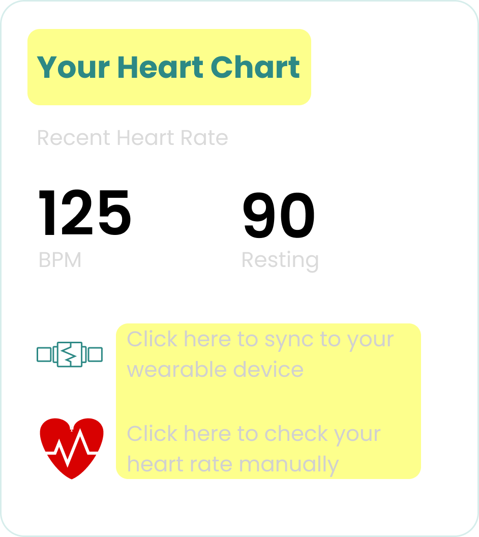
The “Your Heart Chart” card on the desktop viewport was renamed “Your Heart Rate” because it brought more clarity to some users. Additionally, the presentation was simplified and given a cleaner look.

On the mobile view, the “create new message” icon was changed from a message icon at the top of the screen to a larger “plus sign” button at the bottom of the screen. Participants requested this based on familiarity bias.


Conclusion
In addition to the improvements gleaned from the usability testing phase, I pared down the use of color to create better information hierarchy. This refined the site’s navigation.
The Solution


Because I have little familiarity with the medical field, learning about health care resources in general and heart health specifically was a challenging task. As far as the design process itself, I experienced the greatest learning curve in translating my user research into usable information architecture. If I could do this project again, I would have spent more time researching the various ways in which users could navigate this tool.
Key Learnings
The amount of research that I did to create this website showed me that I am capable of taking on information-heavy projects in UX/UI design. I feel confident in my ability to empathize with users and to carefully define a problem before moving on to solutions.
What I Am Most Proud Of
Currently, iHeartMyHeart provides tools for patients to measure their health data, receive customized information based on that data, and communicate directly with their providers through a messaging feature. At this stage, I would be interested in researching and designing stronger resources for health care providers on this website that could directly assist in their daily responsibilities.